HTML design constructor for CS-Cart
HTML design constructor for CS-Cart
The functionality of the module adds the ability to quickly and easily layout pages using the Weber constructor. This is a simple and straightforward game-like way that makes you feel like a pro without having any programming skills.
For information on compatibility with other modules, see product features:
For CS-Cart - https://maurisweb.ru/programmy...
For Multi-Vendor - https://maurisweb.ru/programmy...
SCOPE OF APPLICATION
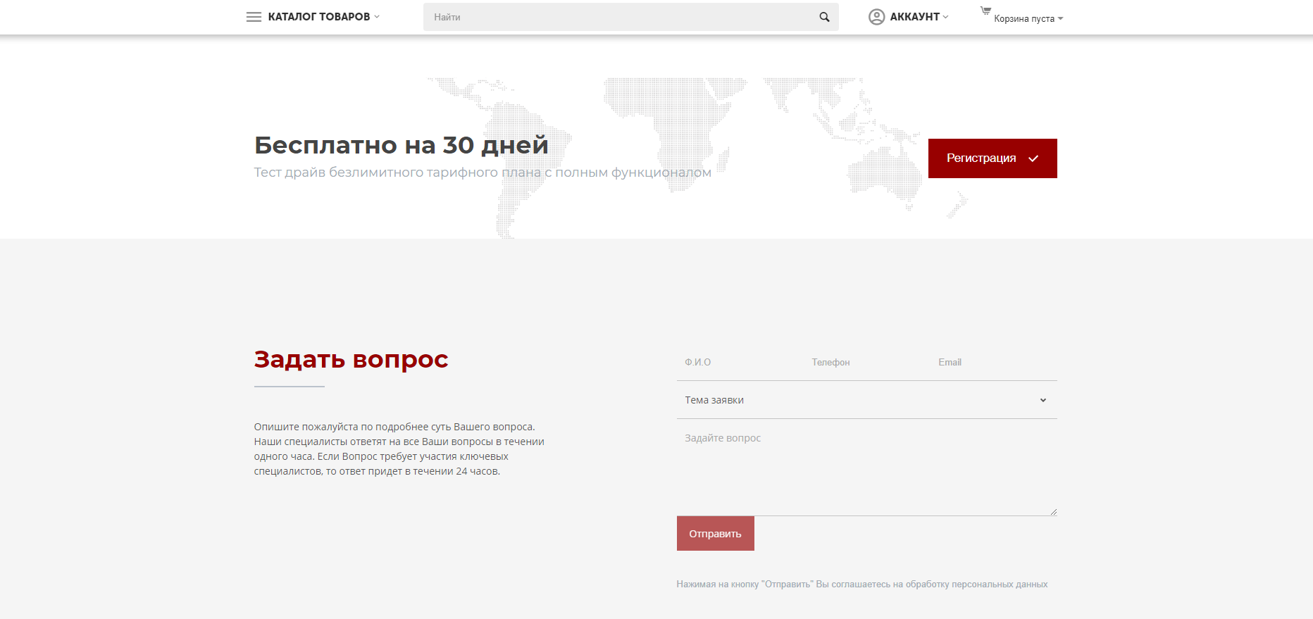
The add-on is suitable for posting content directly through the CS-Cart platform.
EXAMPLE OF APPLICATION
- Homepage;
- Page "About the Company";
- Catalogs of goods and services;
- Section "Team", etc.
SPECIFICATIONS
- Creation of projects in the website builder;
- Editing different versions of the project;
- Creation of custom templates;
- Creation of privileges to change the project.
FEATURES OF THE MODULE
- Simple and straightforward website development;
- Flexible styling system;
- Simple but powerful modal block.
DESIGNER POSSIBILITIES
Using the constructor, it will not be difficult to create a website!
The ready-made set of tools contains everything you need to create web pages.
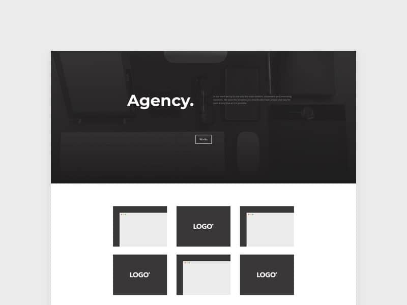
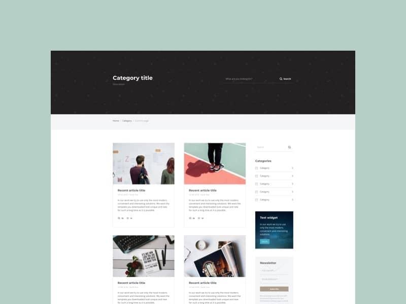
Choose from 33 ready-made templates.
You can build powerful yet simple websites with ease. Create web pages by simple navigation without coding skills.
Drag and drop sections, edit content with one click. No more coding skills required.
One of the most important features is the new responsive styling system. Work with a full set of CSS options, pre-built visual effects classes, local and global adaptive style changes for multiple elements at the same time.

Edit everything without getting confused by a huge number of files. Create content faster and easier with a new search tool and new folder systems. Now you will be doing the right things at the right time and in the right place.
A simple yet powerful dropdown is a technique for creating a small block per page. Modal dialog boxes are a way to quickly present information to users on the same page they are working on, which improves the usability of your site and reduces unnecessary page reloads.
Use the Code Editor system to quickly edit color-coded code.
Create blocks very quickly by switching from the visual editor to the source editor, while the changes are always visible on both screens.
The constructor has a complex visual editor for creating forms for any purpose. Contains standard and specific input elements such as "attach file" or "set date". Customize any form and connect it to your email or marketing service.

CONFIGURING THE MODULE
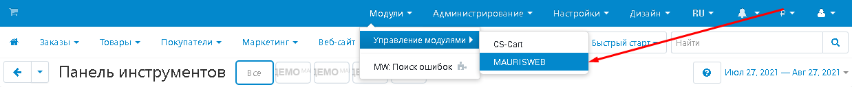
1. To install a module, go to the "Modules" tab, in the pop-up menu, select "Manage modules" and "MAURISWEB".
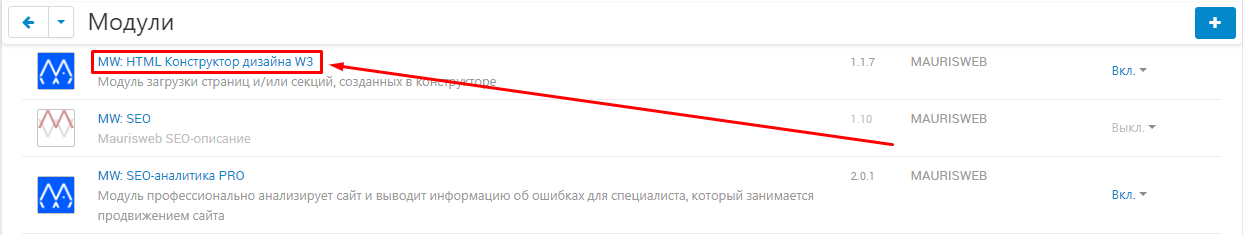
2. In the list that opens, select the module you are interested in and click on its name, highlighted in blue or black.
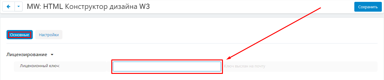
3. On the page that opens, select the "General" tab. If the license key is not set automatically and the module settings will be blocked, go to your account at www.maurisweb.ru, copy the license key and paste it into the appropriate item. The key has also been sent to your email.
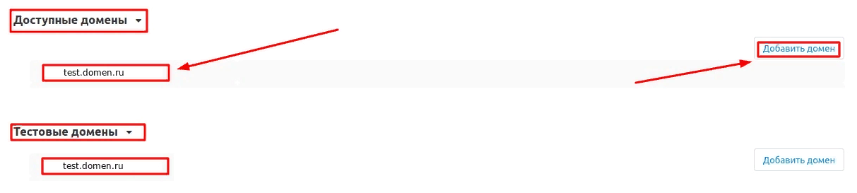
4. In the "Available domains" and "Test domains" sections, check the correctness of the specified domains. You can add additional domains by clicking on the white "Add Domain" button on the right side of the page. The total number of domains should not exceed three.
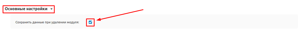
5. Go down below, select the "Basic settings" section and tick the box "Save data when removing the module" so as not to lose them when reinstalling the module.
6. Go to the "Settings" tab. Select the desired storefront, or allow access to the input fields for all stores. To do this, click on the button in the form of several silhouettes to the right of the required input field.
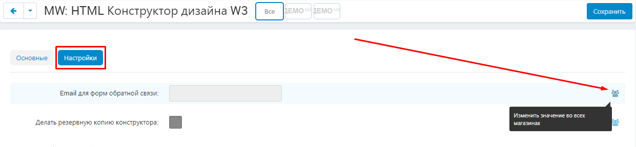
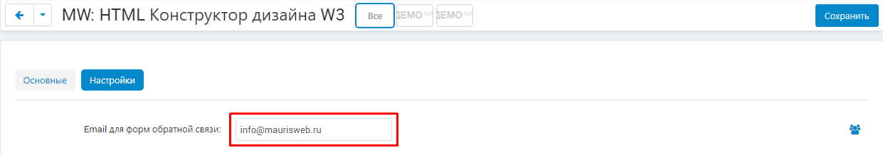
7. Enter the email, which will receive letters from the feedback forms.
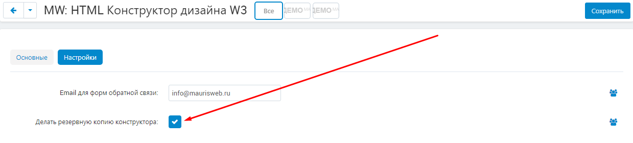
8. In order to copy the constructor when creating a backup copy of the site, check the box "Make a backup copy of the constructor".
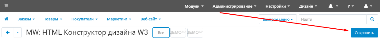
9. Save the module settings. To do this, click on the blue "Save" button in the upper right corner of the panel.
FUNCTIONALITY OF THE MODULE
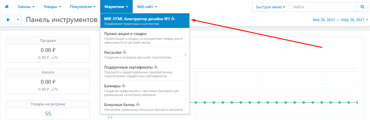
1. To go to the module's functionality, go to the "Marketing" tab and select the "MW: HTML Design Builder W3" section.
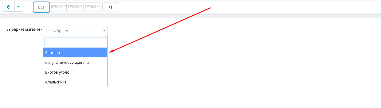
2. Select a storefront.
3. In the "Projects" section, all saved projects and their versions will be displayed.
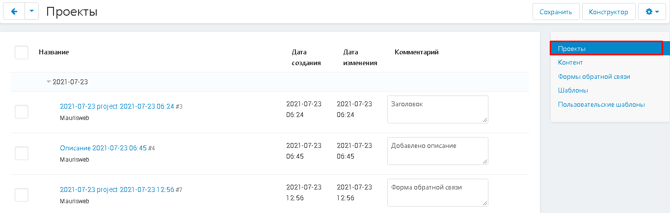
4. In the "Content" section, all available content will be displayed.
5. In the "Feedback Forms" section, content with feedback forms will be displayed.
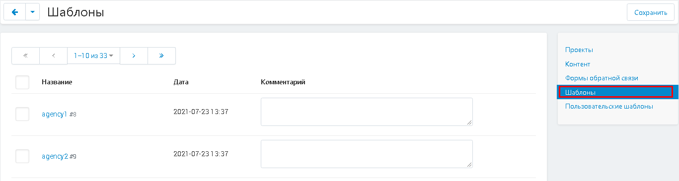
6. The "Templates" section displays the available designer templates.
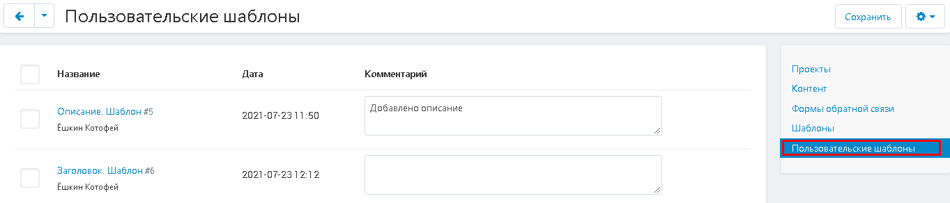
7. The Custom Templates section displays the custom templates.
PROJECT CREATION
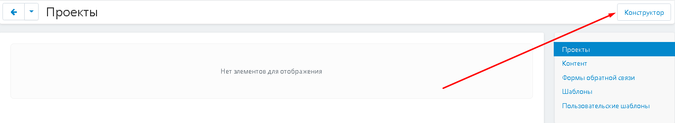
1. The constructor is embedded in the platform, to go to the creation of the project, click on the white button "Constructor" in the upper right corner of the panel.
Attention!
To protect kernel data, the constructor runs in a browser session. If you have been working for some time and reloaded the page, or the browser session has ended, then access will be closed until you enter through your personal account.
3. After finishing work with the designer, the project will appear in the "Projects" tab. By default, its name will be the date of creation.
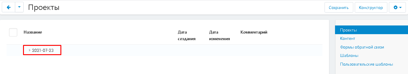
4. Click on the triangle to view the project tabs.
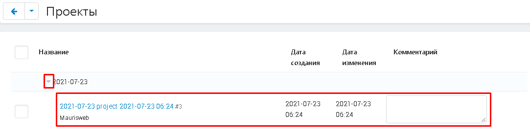
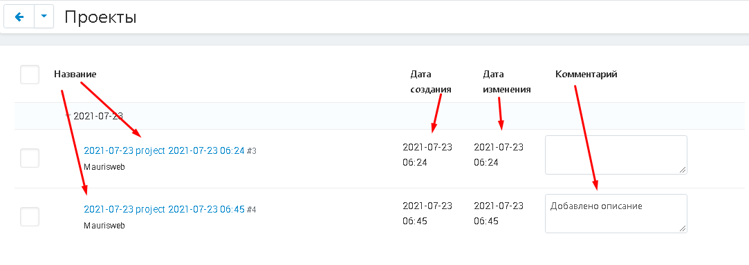
5. If the project has several versions, they will be displayed in different lines. The name will reflect the date and time the version was created. You can also add a comment for each version so you know what changes have been made.
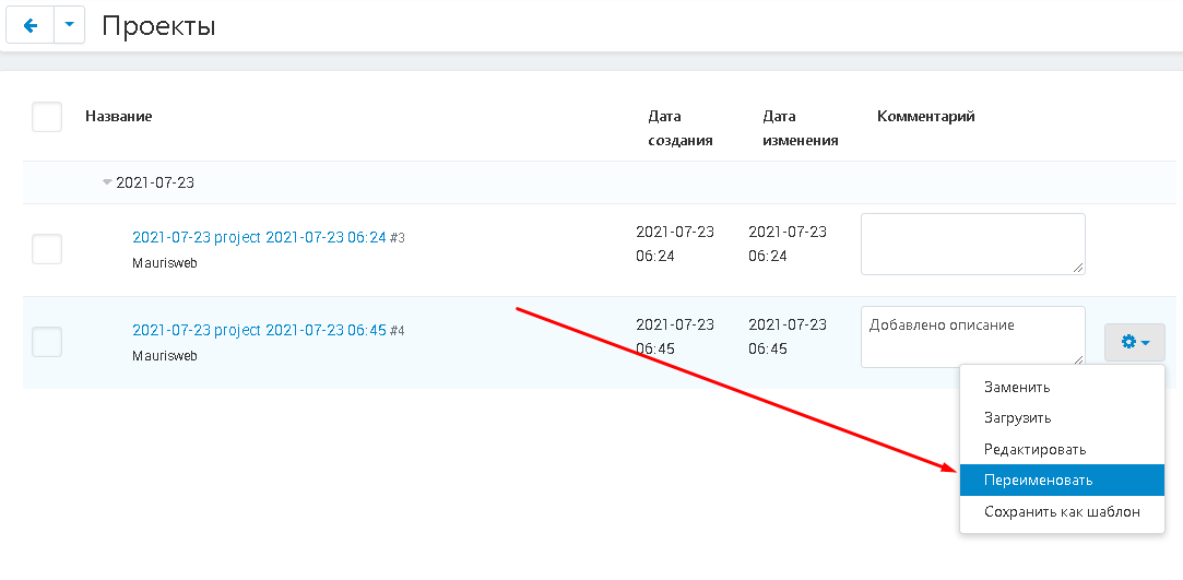
6. To change the name of the version, click on the gear-shaped button and select the "Rename" function.
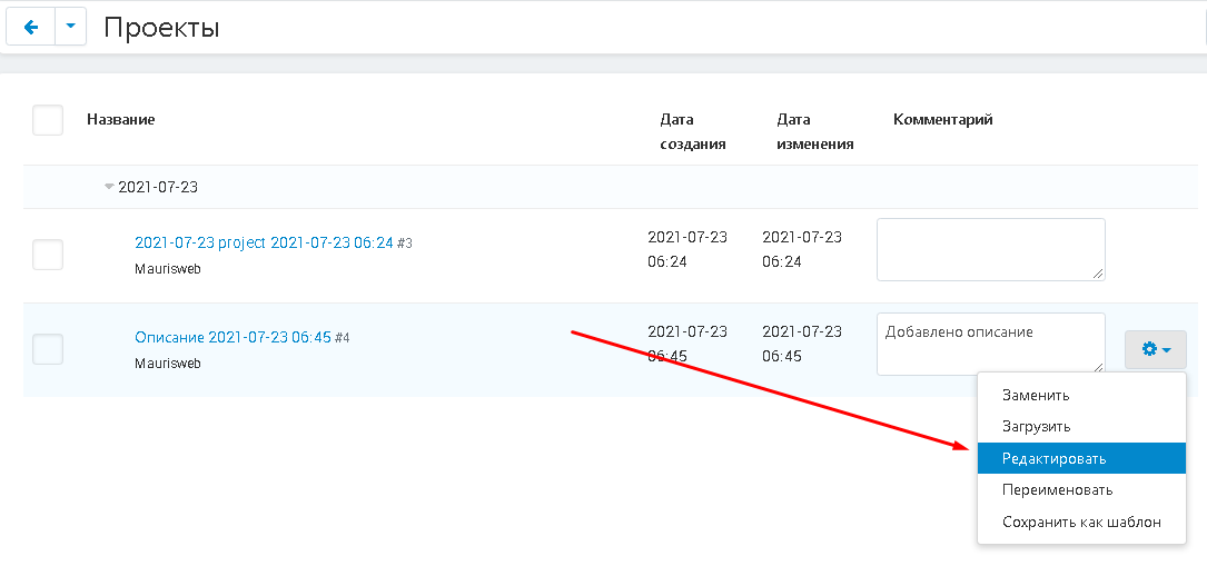
7. To proceed to editing the version through the designer, select the "Edit" function.
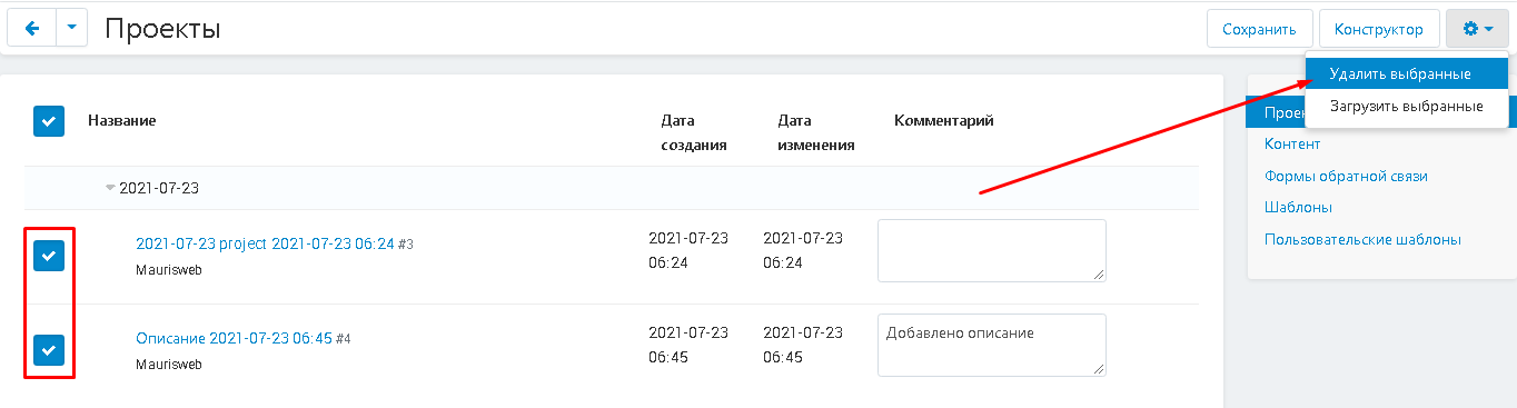
8. To delete a version or project, mark it with a checkmark, click on the gear-shaped button in the upper right corner of the panel and select the "Delete Selected" function.
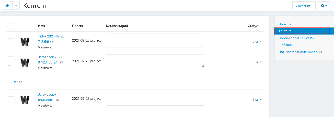
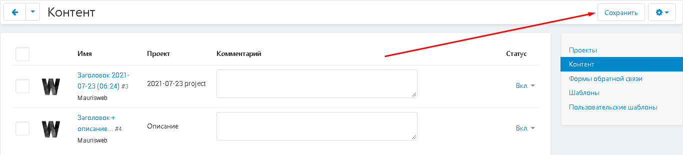
CONTENT
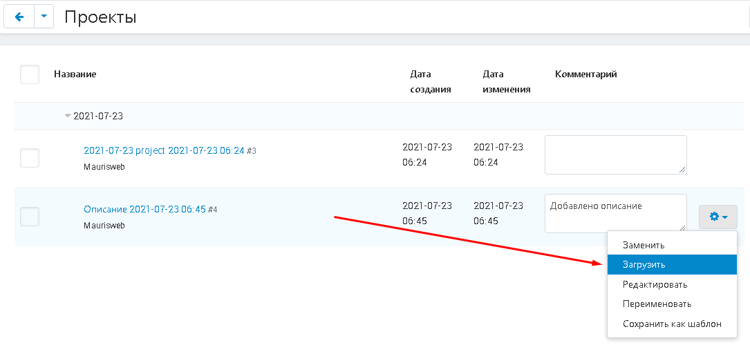
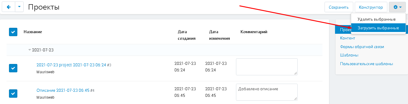
1. To translate projects created in the constructor into content pages, click on the gear-shaped button and select the "Load" function
or use bulk upload.
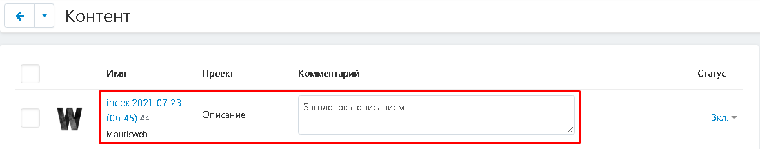
2. Projects are converted to content. You can add a description to the page in the "Comment" column.
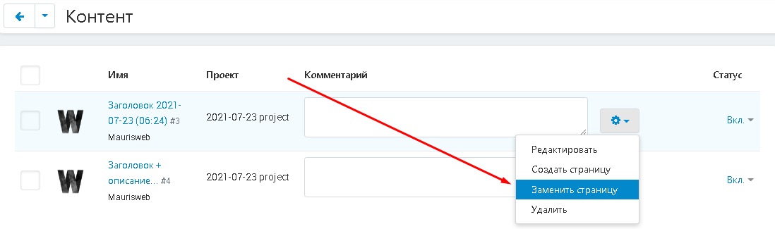
3. Click on the gear-shaped button on the right side of the row to make changes to the page:
"Edit" - change content;
"Create Page" - create a new empty content page;
"Replace page" - replace one content page with another;
"Delete" - delete the page.
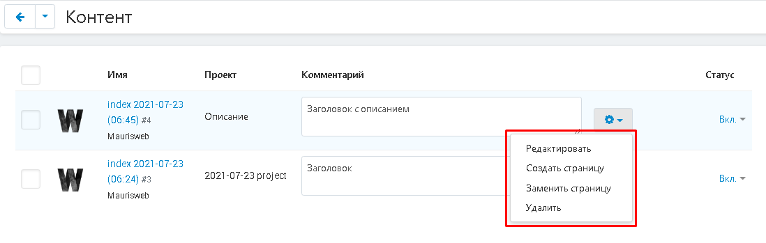
4. After making changes, click on the white "Save" button in the upper right corner of the panel.
REPLACEMENT OF PROJECT / CONTENT
1. To replace one page with another, in the projects tab, click on the gear-shaped button next to the required project and select the "Replace" function.
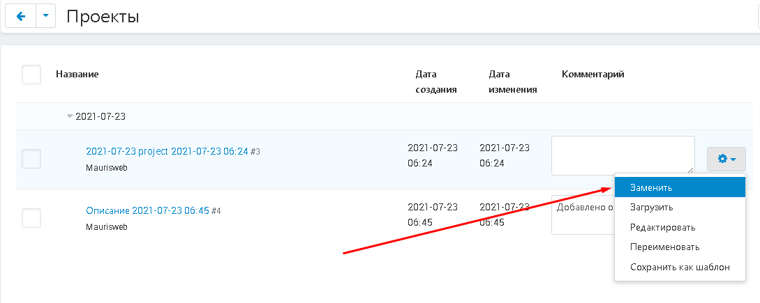
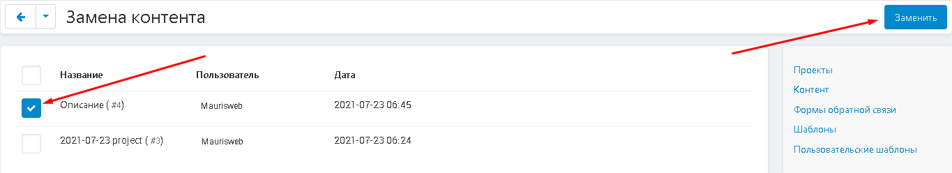
2. A list of pages available for replacement will open. Check the box next to the selected page and click on the "Replace" button in the upper right corner of the panel.
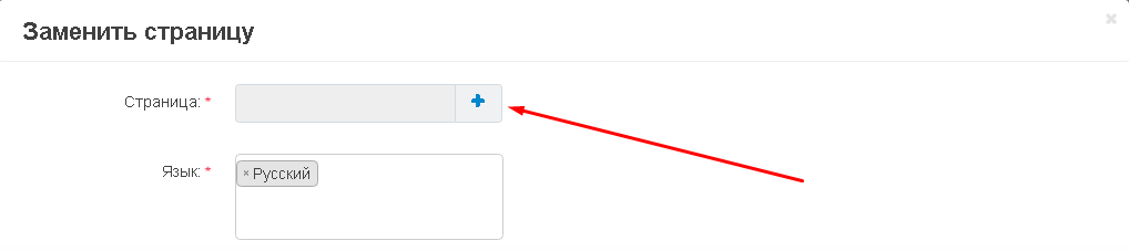
3. You can also replace the created content with any existing page on the marketplace.
4. In the window that appears, click the button in the form of a plus sign.
5. Select a page from the list that appears and click on the blue "Select" button in the lower right corner of the window.
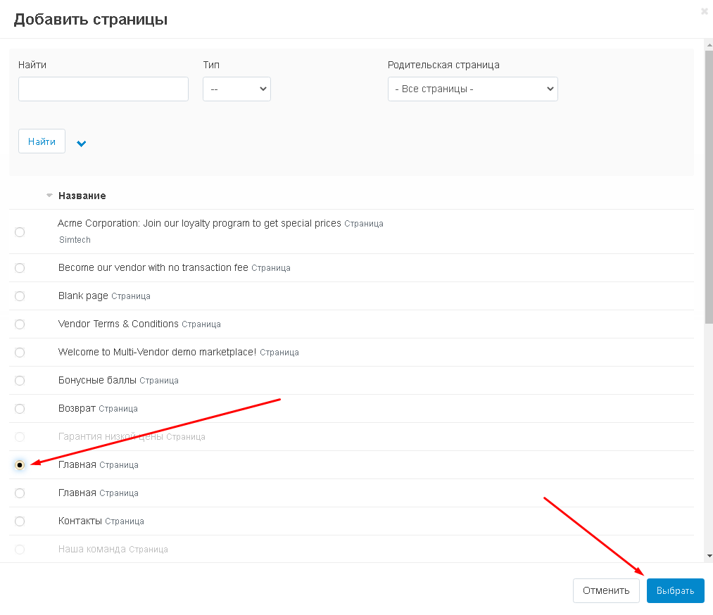
6. Complete your selection by clicking the white Change Page button in the lower right corner of the panel.

CREATING A TEMPLATE
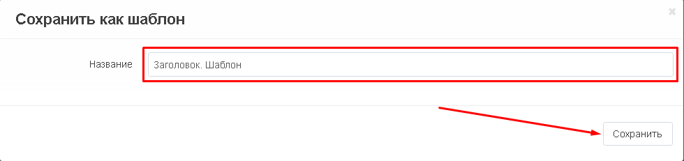
1. To create a template from the created page, click on the gear-shaped button next to the required project and select the "Save as template" function.
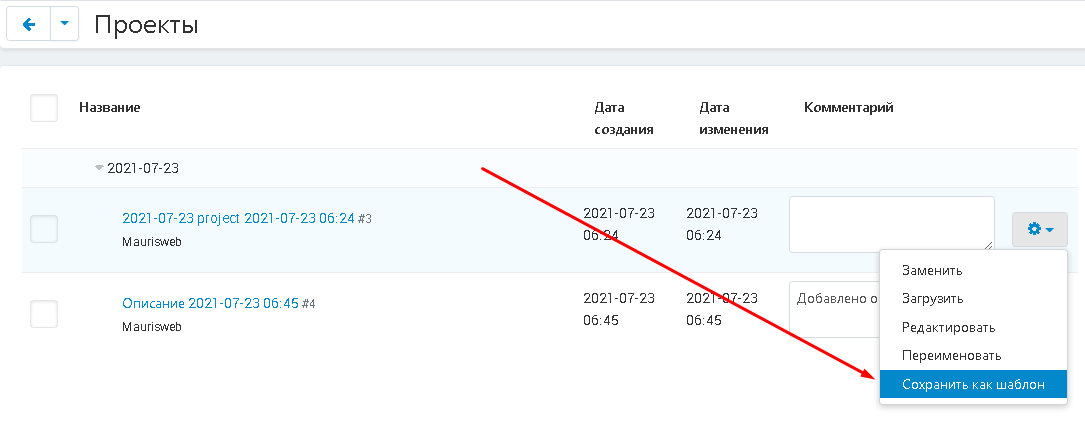
2. Enter the name of the template and click the "Save" button.
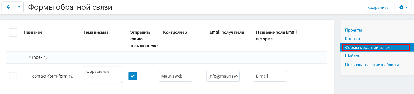
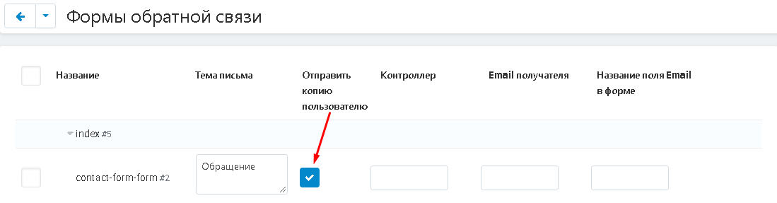
FEEDBACK FORM
1. If a project is created with a feedback form, then it can be configured.
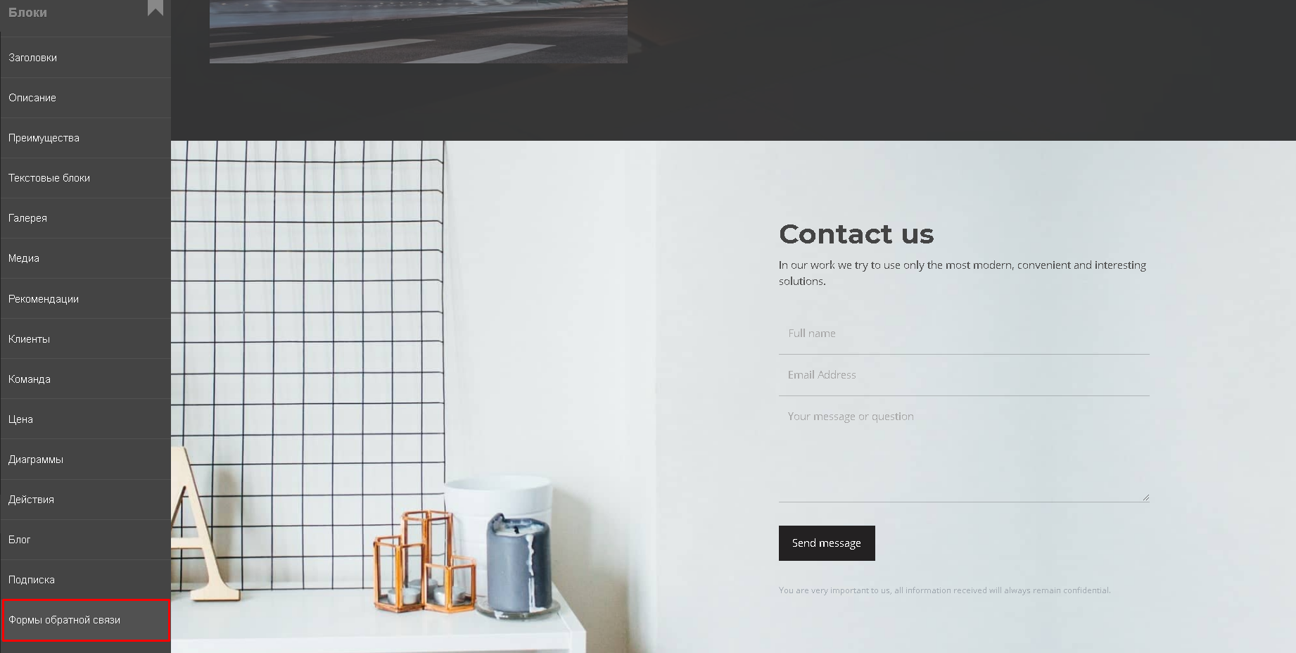
2. To do this, the project must be loaded into the content page (see the section "Projects" and "Content") and displayed in a separate tab.
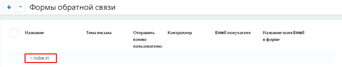
3. Click on the triangle next to the title, expand the list and write the subject of the letter.
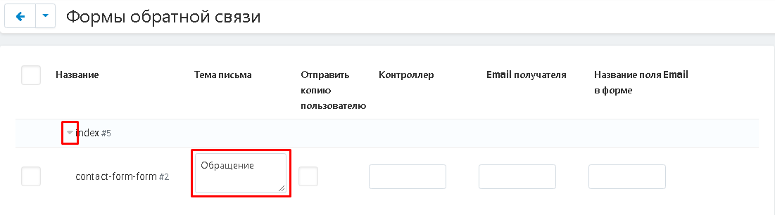
4. Check the box "Send a copy to the user" if you want a copy of the message that the user sent through the feedback form to be sent to his mail.
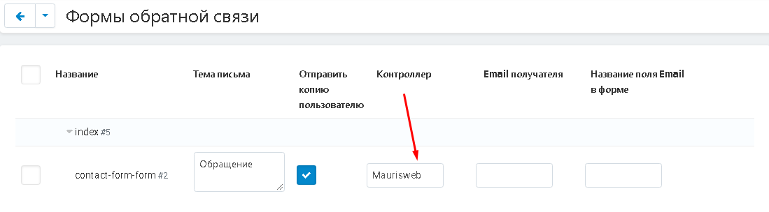
5. In the "Controller" section, enter the name or position of the letter controller.
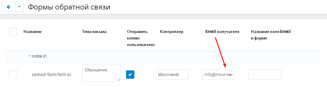
6. In the item "Email of the recipient" enter the email of the recipient.
7. In the "Name of the Email field in the form", enter the name of this field that will be displayed in the feedback form.
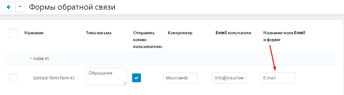
8. When you are finished making all the changes, click the white "Save" button at the top right of the panel.

TEMPLATES
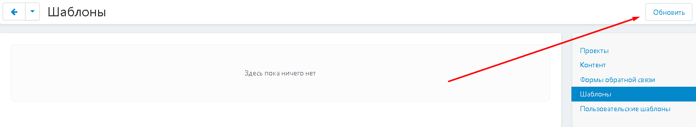
1. Go to the "Templates" tab. When using the module for the first time, you need to click the white "Refresh" button in the upper right corner of the panel to display a list of templates on the page.
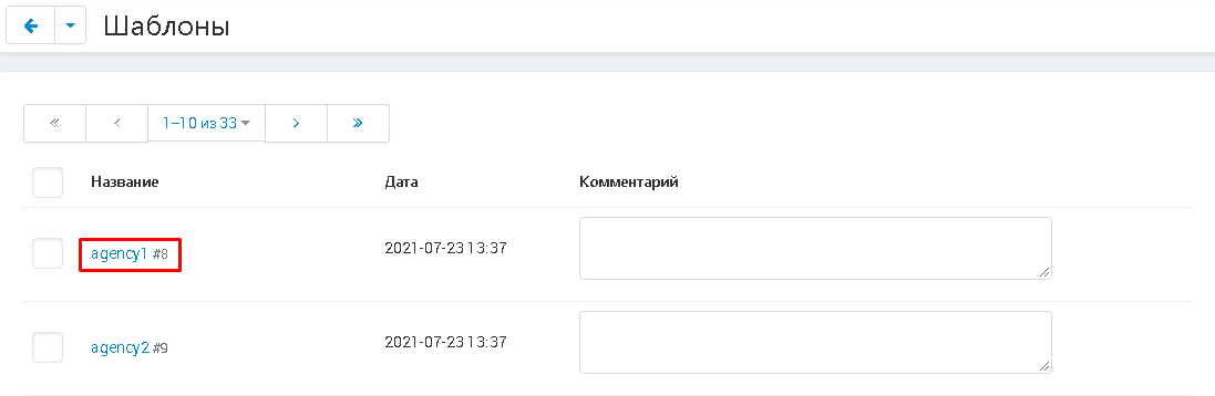
2. After the update, a list of standard templates will be displayed. There are 33 of them. To open a template, you need to click on its name, highlighted in blue.
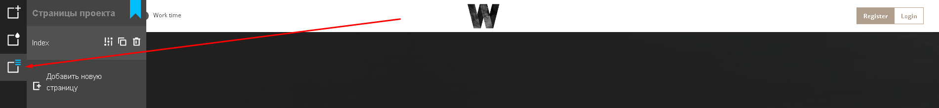
3. When the designer opens, in the left side menu select the "Project Pages" button (the third button from the top is in the form of a white square with three small blue stripes in the right corner).
4. In the drop-down menu at the very bottom of the page, select the download icon (third from the left).
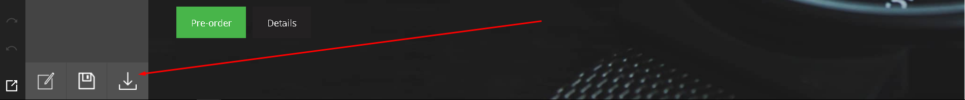
5. The template will be loaded, which you can change as you wish.
ADD CONTENT TO BLOCK
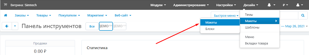
1. To display content on the storefront, go to the "Design" tab and select the "Layouts" section, the "Layouts" subsection
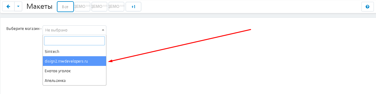
2. Select a storefront.
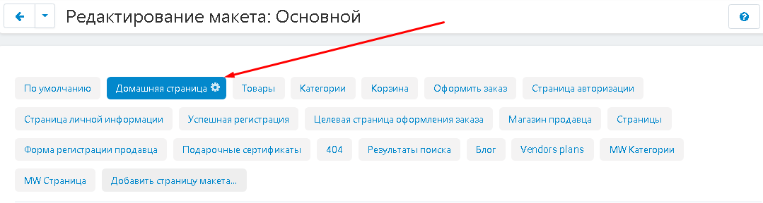
From the tabs that appear, select the appropriate page where you want to place the page you created.
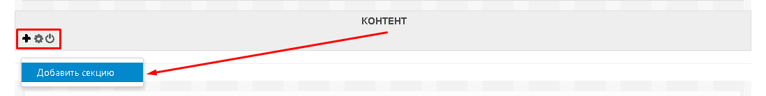
3. Scroll down to the "Content" section. Move your cursor to the lower left corner where three buttons will be reflected. Press the button with the plus sign (a hint will pop up on hover) and select the "Add section" function.
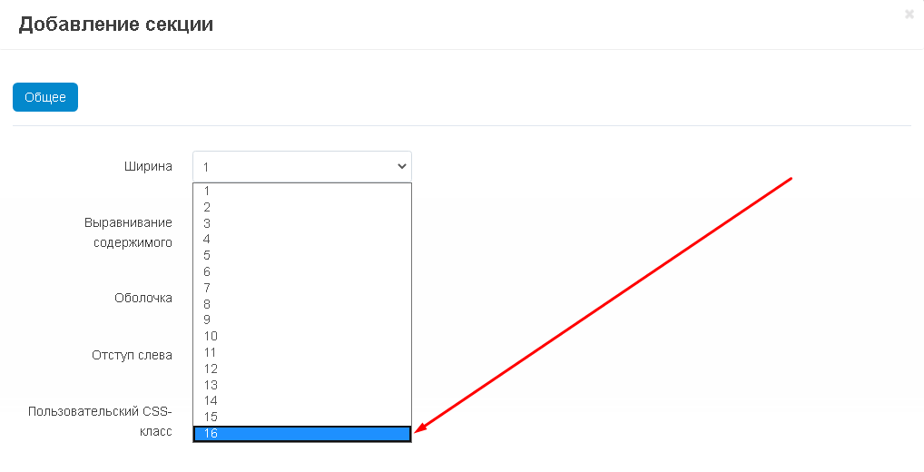
4. In the window that opens, in the "General" tab, select the "Width" item, click on the arrow and set the value "16", since this is the optimal width for this section.
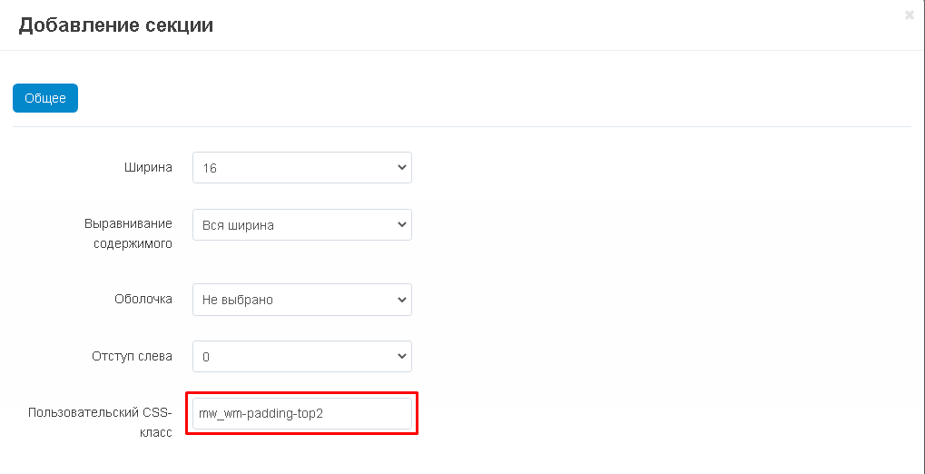
5. If you need to make indents between sections, then in the "Custom CSS class" field, insert the necessary CSS classes without quotes, separated by a space. In order to indent with the desired pixel value from 1 to 5, in the name of the below CSS classes, replace the number 1 with the desired one:
"mw_wm-padding-top1" - if you need to indent the top;
"mw_wm-padding-bottom1" - if you need to indent from the bottom;
"mw_wm-padding-left1" - if you need to indent to the left;
"mw_wm-padding-right1" - if you need to indent to the right.
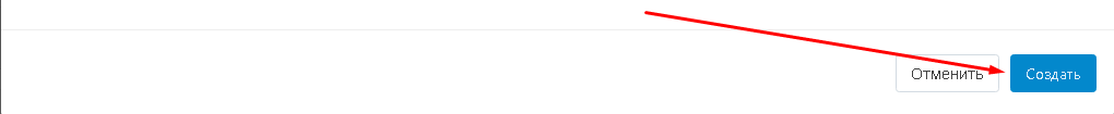
6. To complete the creation process, click on the blue "Create" button in the lower left corner of the window.
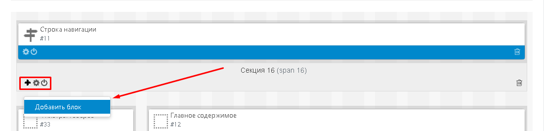
7. Move the cursor over the left corner of the created section, click the plus sign button and select "Add Block".
8. In the window that opens, go to the "Create a new block" tab and select the "MW: HTML Constructor W3" block.
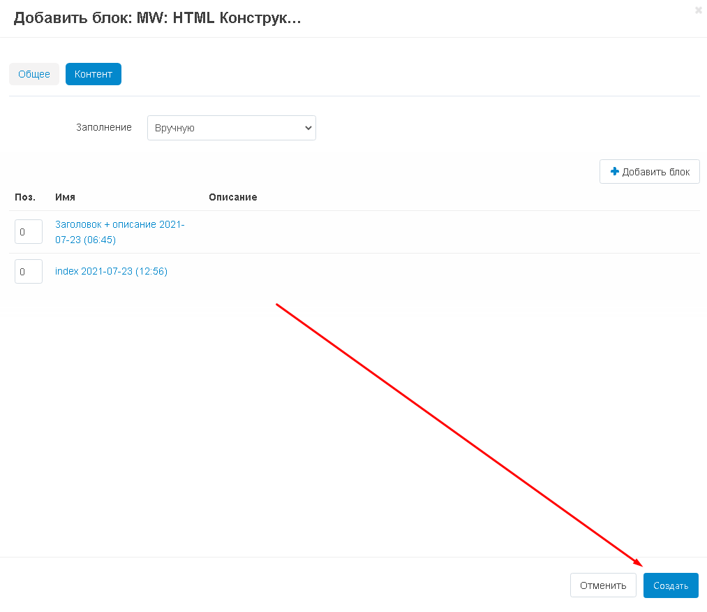
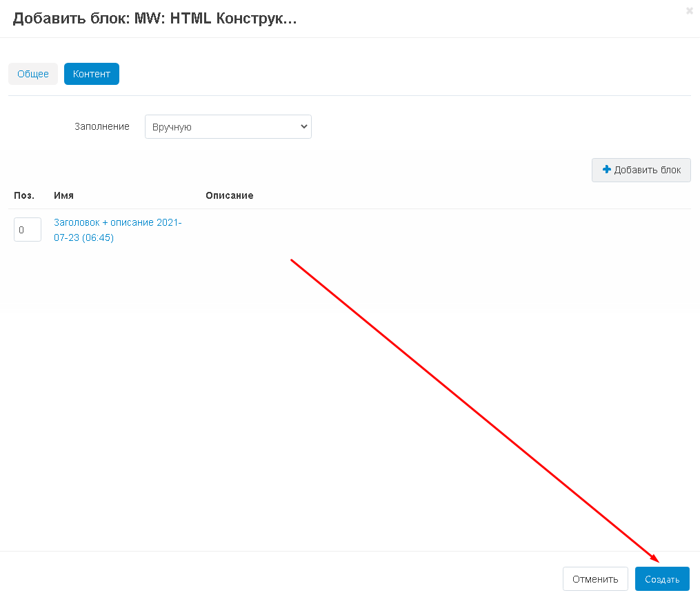
9. The window for adding a block will open. In the "General" tab, enter the name of the block in the "Name" field.
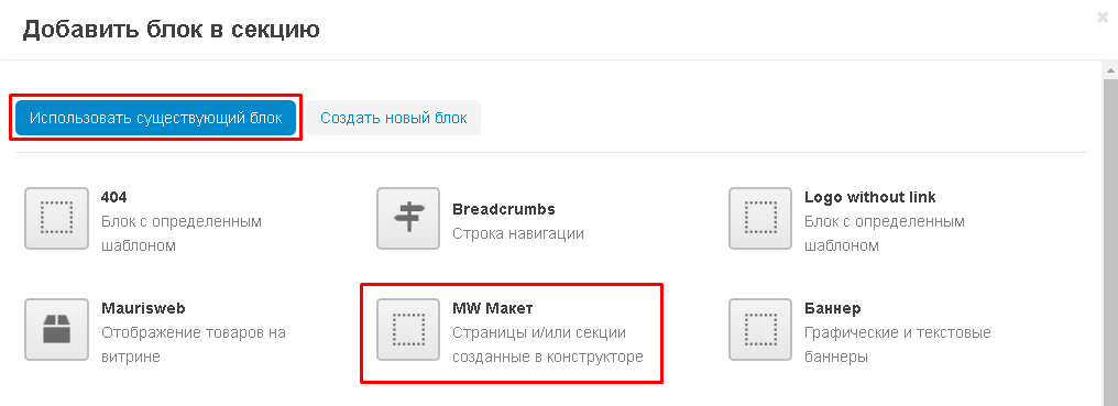
10. Go to the "Content" tab and click the white "Add Block" button in the right corner.
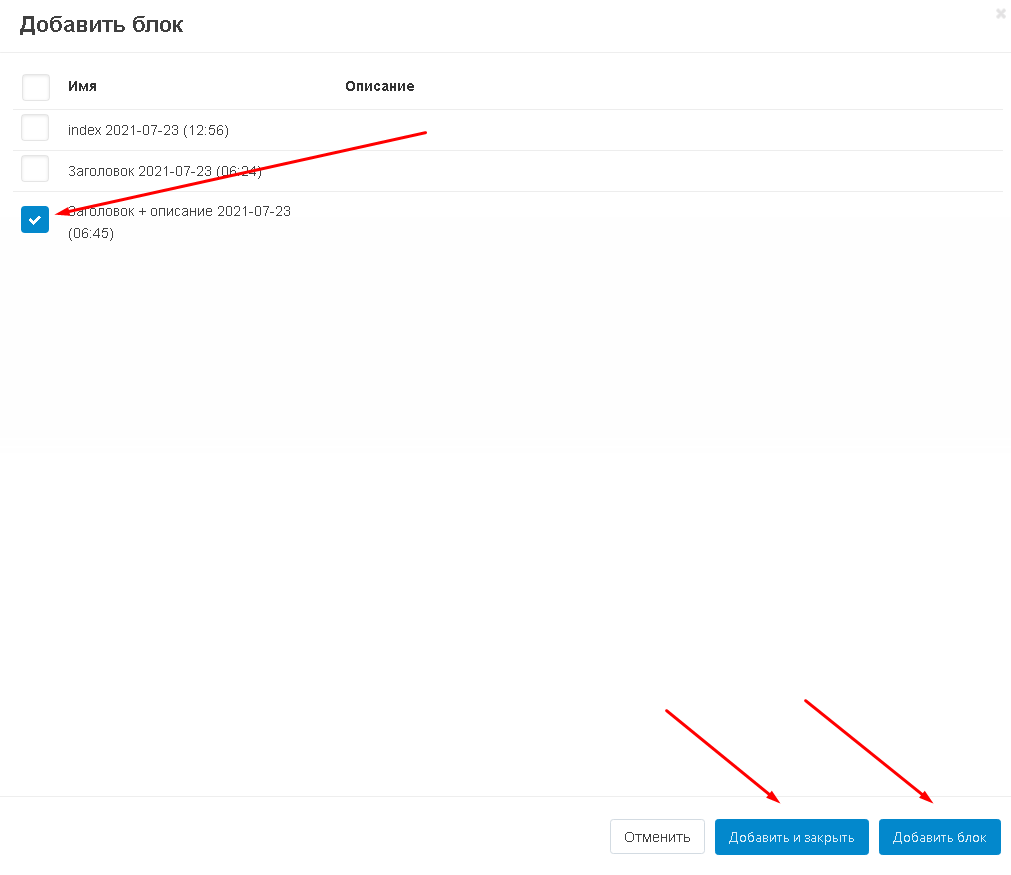
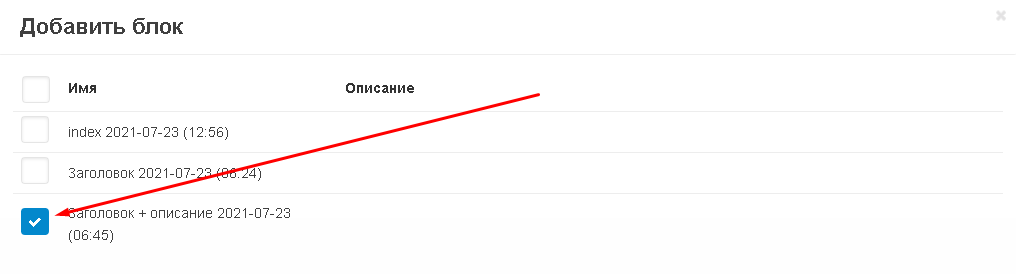
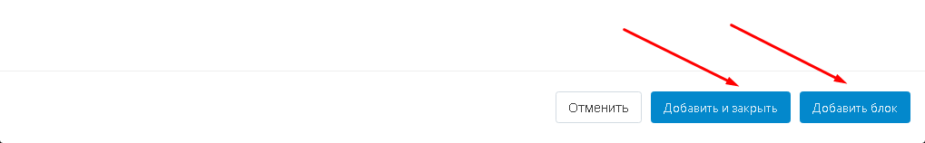
11. In the window that opens, check the box next to the content you want to add. Click "Add Block" in the lower right corner to continue with content selection. Or "Add and Close" if the selection is complete.
12. Complete the block creation by clicking the "Create" button in the lower right corner.
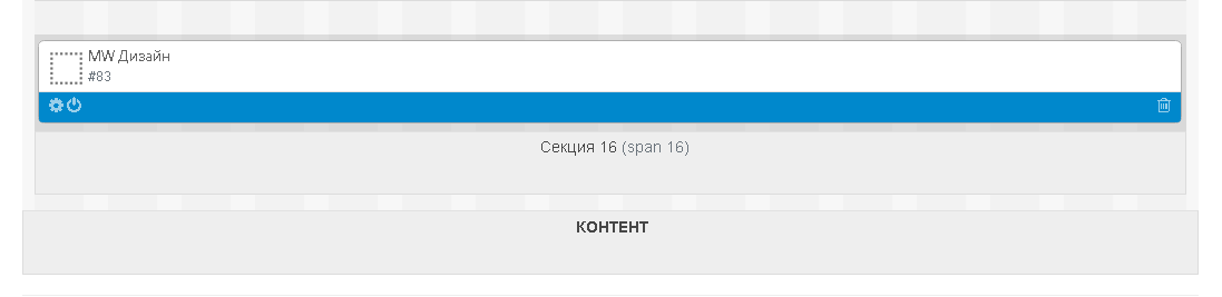
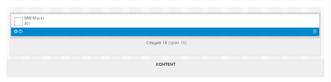
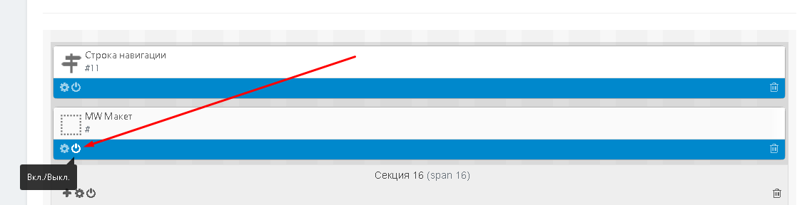
13. The block will appear in the section.
ДОБАВИТЬ КОНТЕНТ, КАК МАКЕТ
Вы можете создать отдельную страницу для вашего контента. Это может быть обычная страница или страница категории.
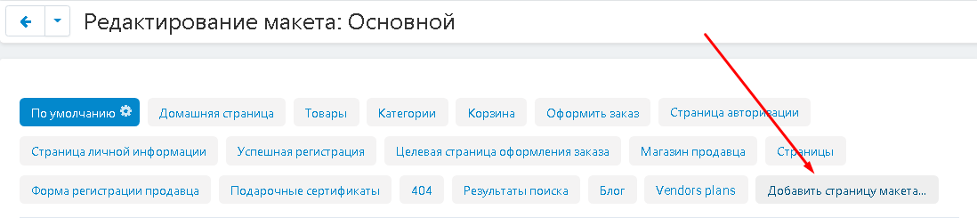
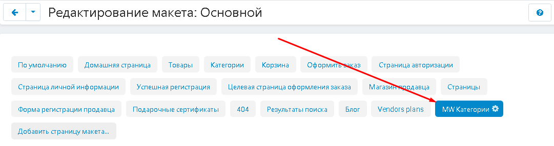
1. На странице редактирования макета выберите вкладку "Добавить страницу макета".
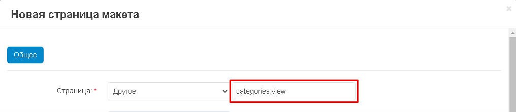
2. В окне создания страницы, во втором поле ввода пункта "Страница" впишите без кавычек "pages.view" (если создаёте страницу) или "categories.view" (если создаёте категорию).
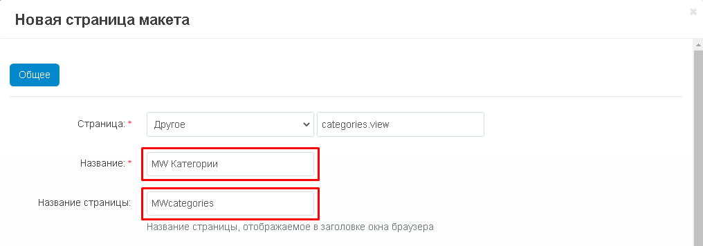
3. В поле "Название" впишите наименование пункта. Обратите внимание, что пункты "Название" и "Название страницы" - это разные поля. В первом случае, это внутреннее название страницы, во втором - оно будет отражаться в окне браузера.
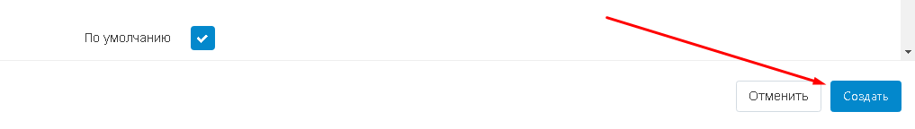
4. По завершении, нажмите синюю кнопку "Создать" в правом нижнем углу окна.
5. В списке появится новая вкладка. Выберите её.
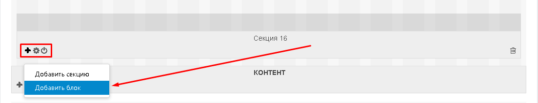
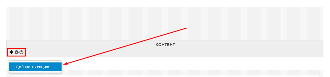
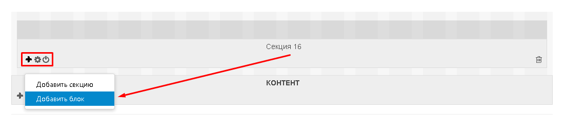
6. Опуститесь ниже, к секции "Контент". Нажмите на кнопку со знаком плюса и выберите функцию "Добавить секцию".
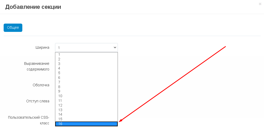
7. Во вкладке "Основные" выберите пункт "Ширина" и установите значение "16", поскольку это оптимальная ширина данной секции.
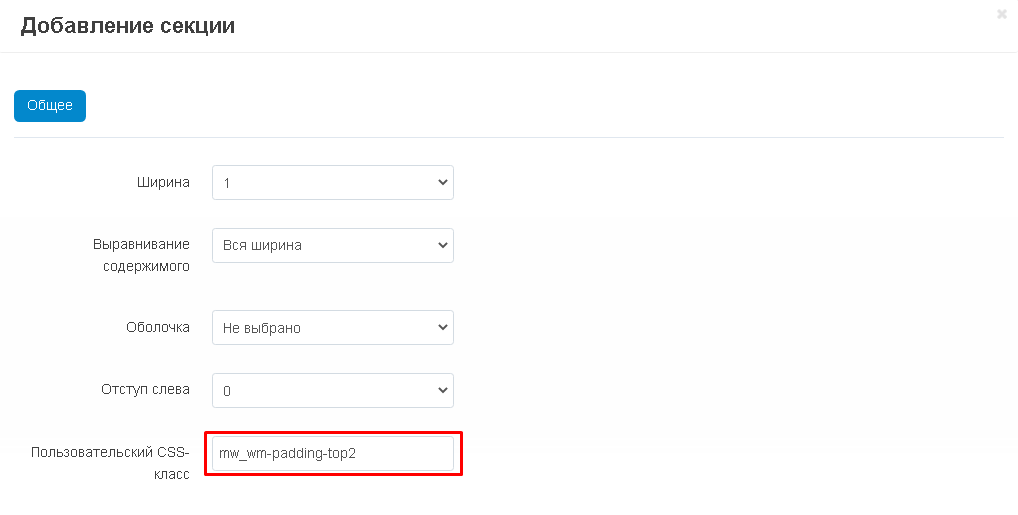
8. В случае, если потребуется сделать отступы между секциями, то в поле "Пользовательский CSS-класс" вставьте нужные CSS-классы без кавычек через пробел. Для того, чтобы создать отступ с нужным значение пикселей от 1 до 5, в имени приведённых ниже CSS-классов замените цифру 1 на нужную:
"mw_wm-padding-top1" - если нужно сделать отступ сверху;
"mw_wm-padding-bottom1" - если нужно сделать отступ снизу;
"mw_wm-padding-left1" - если нужно сделать отступ слева;
"mw_wm-padding-right1" - если нужно сделать отступ справа.
9. Чтобы завершить процесс создания, нажмите на синюю кнопку "Создать" в левом нижнем углу окна.

10. Наведите курсор на левый угол созданной секции (она появится над блоком "Контент"), нажмите кнопку в форме знака плюса и выберите функцию "Добавить блок".
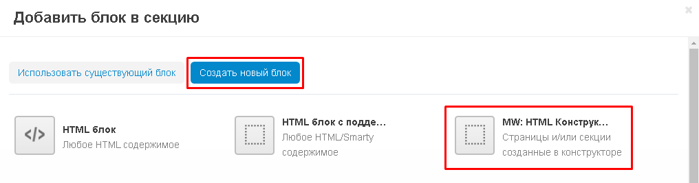
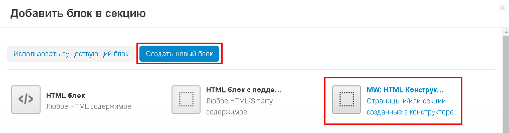
11. В открывшемся окне перейдите во вкладку "Создать новый блок" и выберите блок "MW: HTML Конструктор W3".
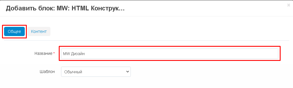
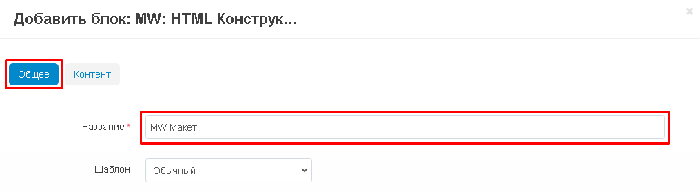
12. Откроется окно добавления блока. Во вкладке "Общее" внесите наименование блока в поле "Название".
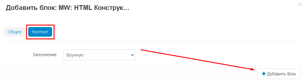
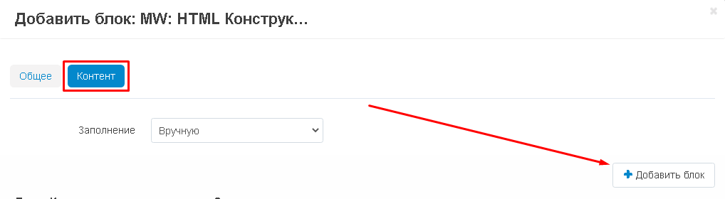
13. Перейдите во вкладку "Контент" и нажмите белую кнопку "Добавить блок" в правом углу.
14. Появится список со страницами. Выберите одну или несколько, отметив их галочками. Или отметьте все, поставив галочку рядом с заголовком.
15. Если вы добавили блок и хотите вернуться к выбору контента, нажмите на синюю кнопку "Добавить" в нижнем правом углу окна. Если выбор закончен, нажмите на кнопку "Добавить и закрыть".
16. Завершите создание блока, нажав в правом нижнем углу кнопку "Создать".
17. Новый блок появится в общем макете. Пользуясь кнопками, его можно отредактировать или выключить.
БЛОКИ ВО ВСЮ ШИРИНУ
Модуль "Блоки во всю ширину" идёт в комплекте и применяется для того, чтобы растянуть блоки во всю ширину экрана. В случае, если у вас установлены модули Alexbranding "UhiTheme2" или "YOUPI", то включать модуль не нужно.
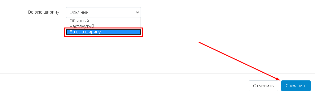
1. Чтобы растянуть блоки во всю ширину, пройдите в настройки нужной секции.
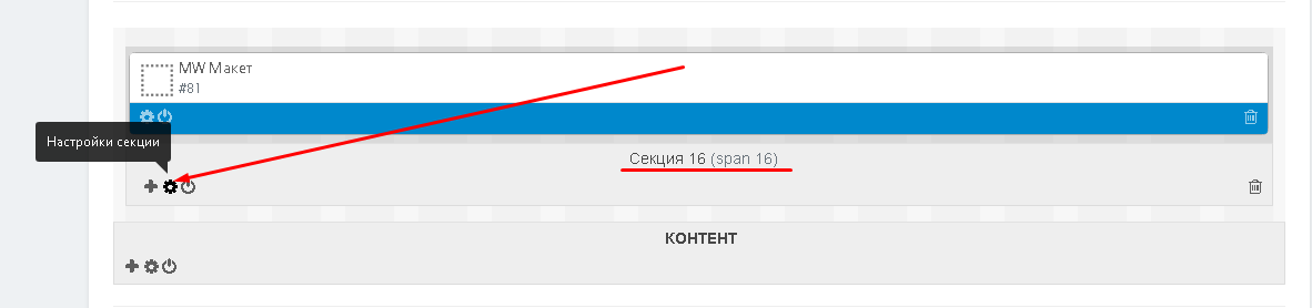
2. Перейдите к пункту "Во всю ширину", разверните дополнительное меню и выберите значение "Во всю ширину".
3. Опуститесь к контейнеру "Контент" и зайдите в параметры контейнера.
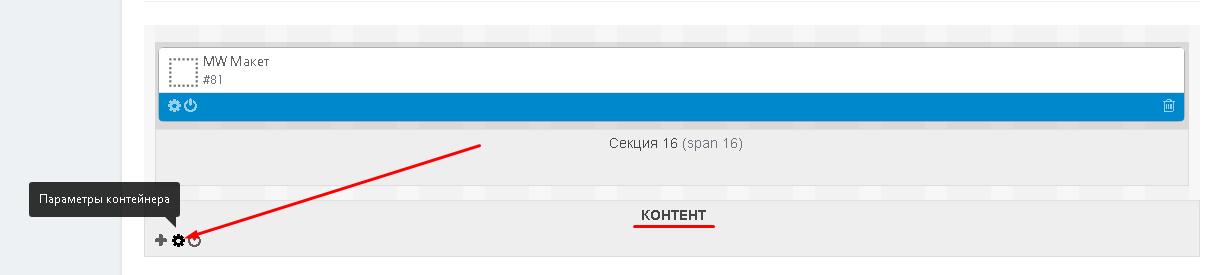
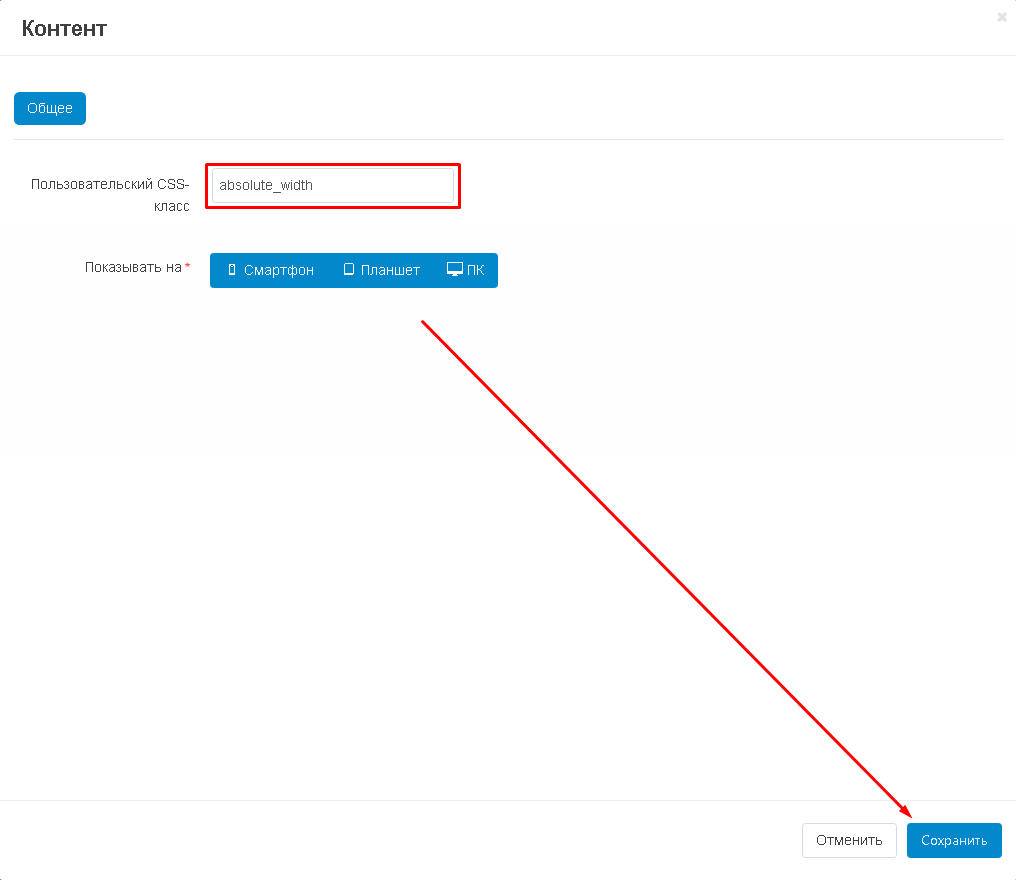
4. В пункте "Пользовательский CSS-класс" впишите без кавычек "absolute_width".
ПУБЛИКАЦИЯ СТРАНИЦЫ
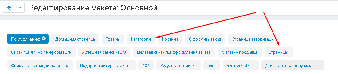
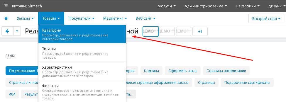
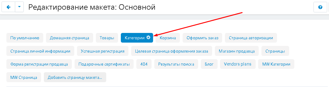
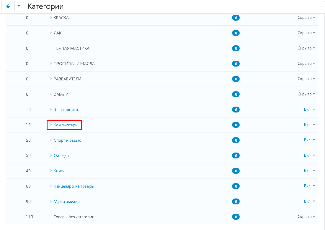
1. Чтобы опубликовать созданную страницу, её нужно привязать к уже существующему макету. Для этого перейдите во вкладку "Товары" и выберите "Категории" (или "Веб-сайт" - "Страницы", если публикуете страницу).
2. Здесь располагается список всех доступных категорий.
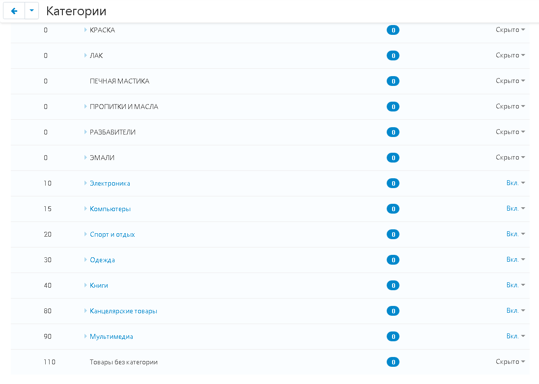
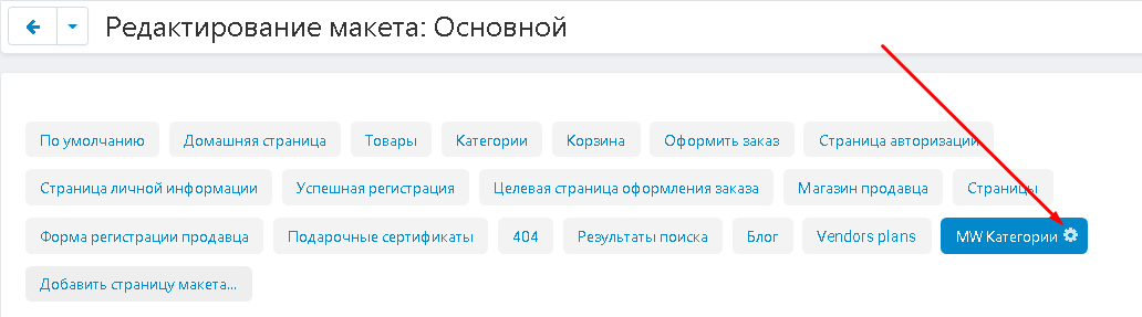
3. Для того, чтобы привязать созданную страницу категории к выбранному макету, перейдите в её настройки, нажав на шестерёнку, рядом с названием вкладки.
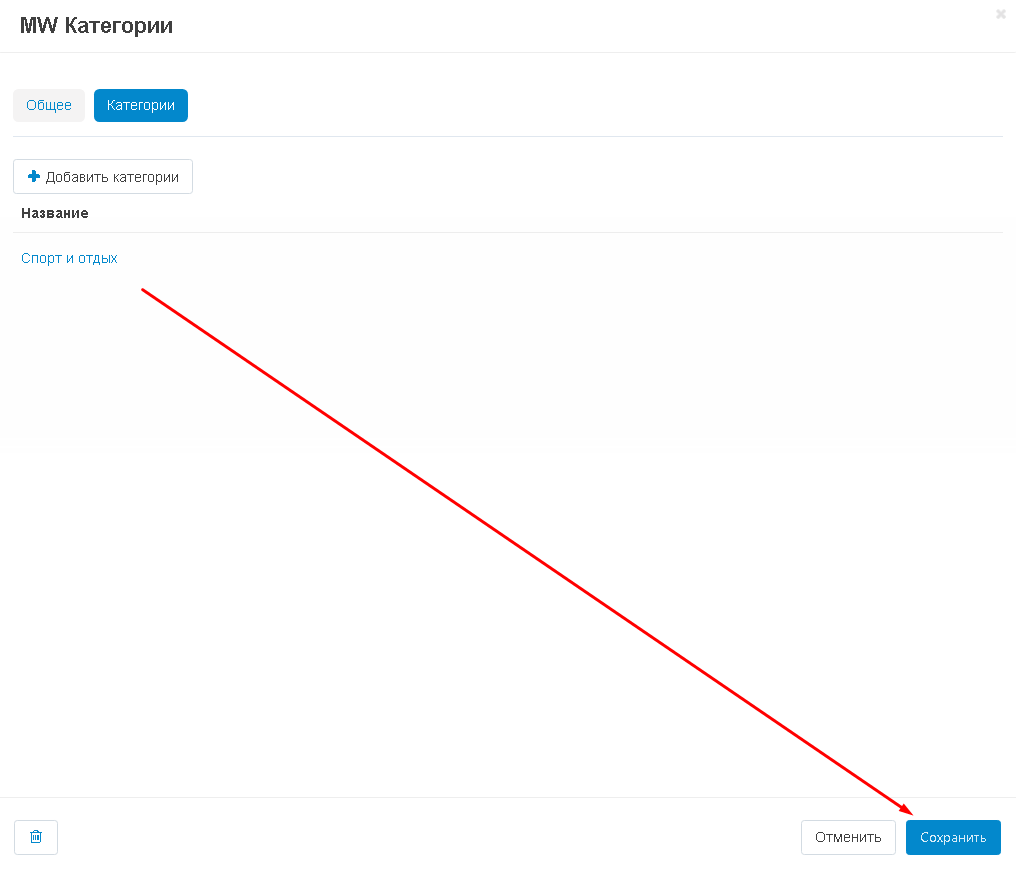
4. Перейдите во вкладку "Категории" и нажмите на кнопку "Добавить категории".
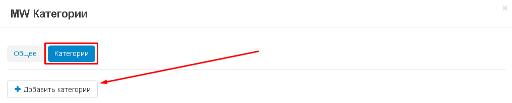
5. Выберите категорию, отметьте её галочкой и нажмите на синюю кнопку "Добавить категории" в нижнем правом углу окна.
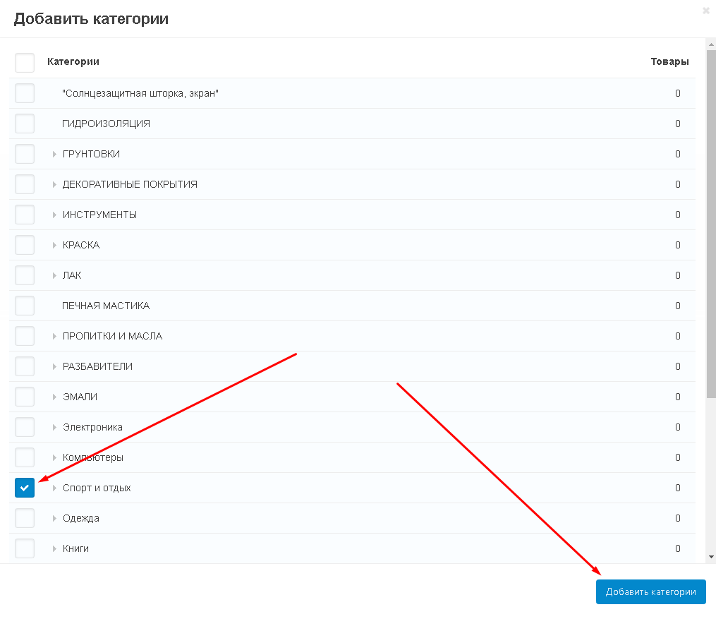
6. Сохраните изменения, нажав на кнопку "Сохранить" нижнем правом углу.
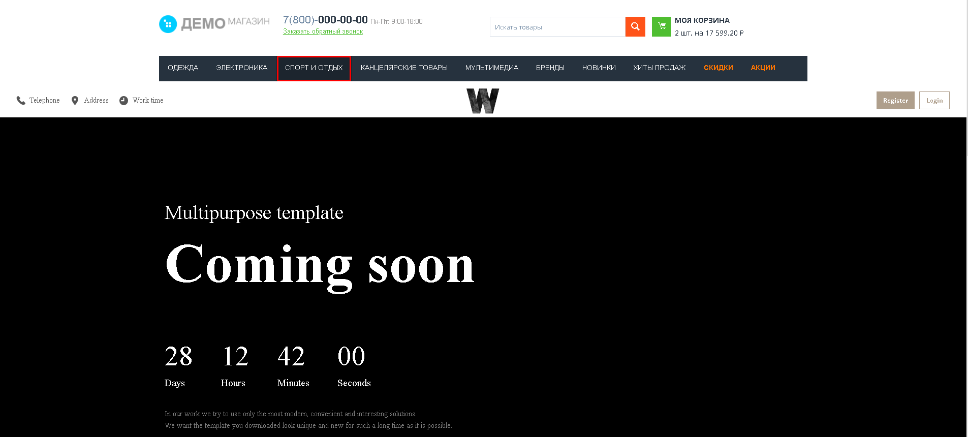
7. Контент будет опубликован отдельной страницей, растянутый во всю ширину экрана.
КОНТЕНТ ДЛЯ ИНДИВИДУАЛЬНОЙ КАТЕГОРИИ
Вы также можете создать индивидуальный контент для категории.
1. Зайдите во вкладку "Категории".
2. Выберите секцию, в которую вы хотите добавить контент, нажмите на кнопку в форме плюса и выберите функцию "Добавить блок".
3. Используйте существующий блок с импортированными страницами из конструктора W3 или создайте новый.
4. Выключите блок, нажав на соответствующую кнопку.
5. Перейдите во вкладку "Товары" и выберите раздел "Категории".

6. Выберите категорию и нажмите на её название, чтобы пройти внутрь.
7. Пройдите во вкладку "Макеты".
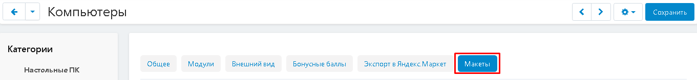
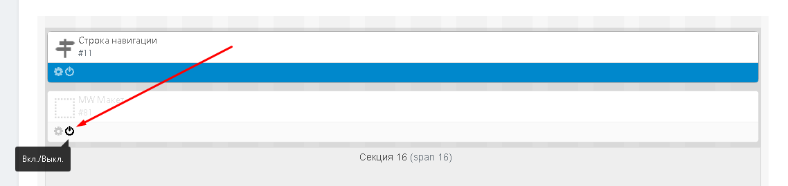
8. Опуститесь к секции, в которую был добавлен блок и включите её.
9. Контент будет опубликован на странице категории.
10. При этом, для других категорий он применяться не будет.
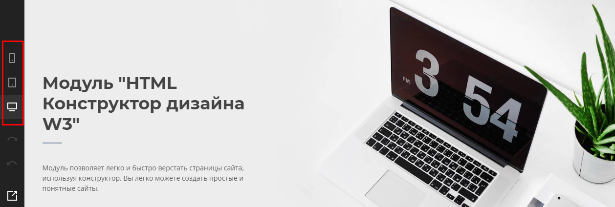
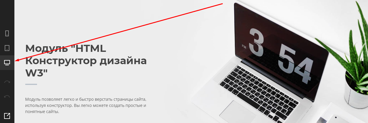
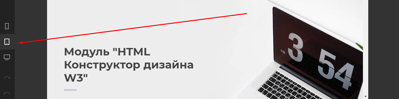
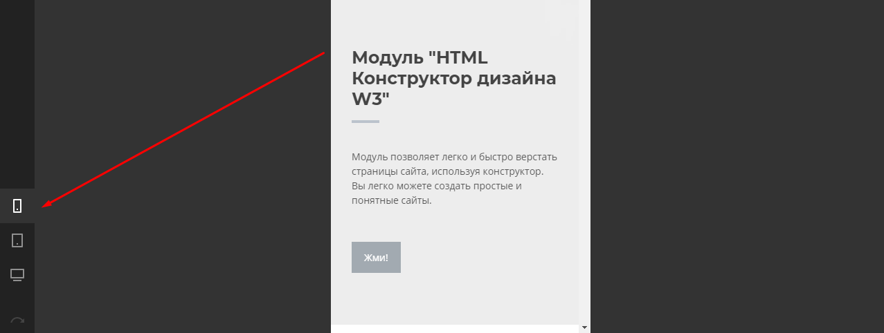
АДАПТИВНОСТЬ и ПРЕДПРОСМОТР
1. На любом этапе создания проекта есть возможность включить предпросмотр и взглянуть на то, как витрина будет отображаться на экране телефона, планшета или компьютера. Внизу бокового меню имеются три кнопки, отвечающие за данную функцию конструктора.
2. По умолчанию, в конструкторе выставлено отображение экрана для компьютера. Переключиться на него можно, если нажать кнопку в форме монитора (первая снизу).
3. Чтобы увидеть отображение для планшета, нажмите кнопку в форме планшета (вторая снизу).
4. Чтобы увидеть отображение для мобильного телефона, нажмите кнопку в форме смартфона (третья снизу).
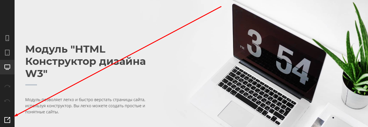
5. Чтобы включить предпросмотр проекта, нажмите на кнопку в форме квадрата со стрелкой ("Предпросмотр") в самом низу бокового меню.
ПРИМЕЧАНИЯ:
1. Имена страниц должны быть не длиннее 50 символов без использования спецсимволов и кириллицы, пишите только на английском языке. Название должно начинаться с латинской буквы, может содержать только латинские буквы, цифры и подчёркивания.
2. В настройках форм поле "Field name" нельзя использовать спецсимволы и кириллицу, пишите только на английском языке. Название должно начинаться с латинской буквы, может содержать латинские буквы, цифры и подчёркивания.
3. Использование модальных панелей невозможно в UniTheme2, YOUPI Theme (невозможно закрыть всплывающие сообщения).
4. Все данные об изменении проекта хранятся в кэше браузера, поэтому если случайно закроется сайт или браузер, выключится компьютер или отключат электричество, никакие данные не потеряются при открытии конструктора загрузится тот проект, который редактировался последним. Чтобы открыть нужный проект, который не является последним, нужно нажать кнопку "Загрузить проект".
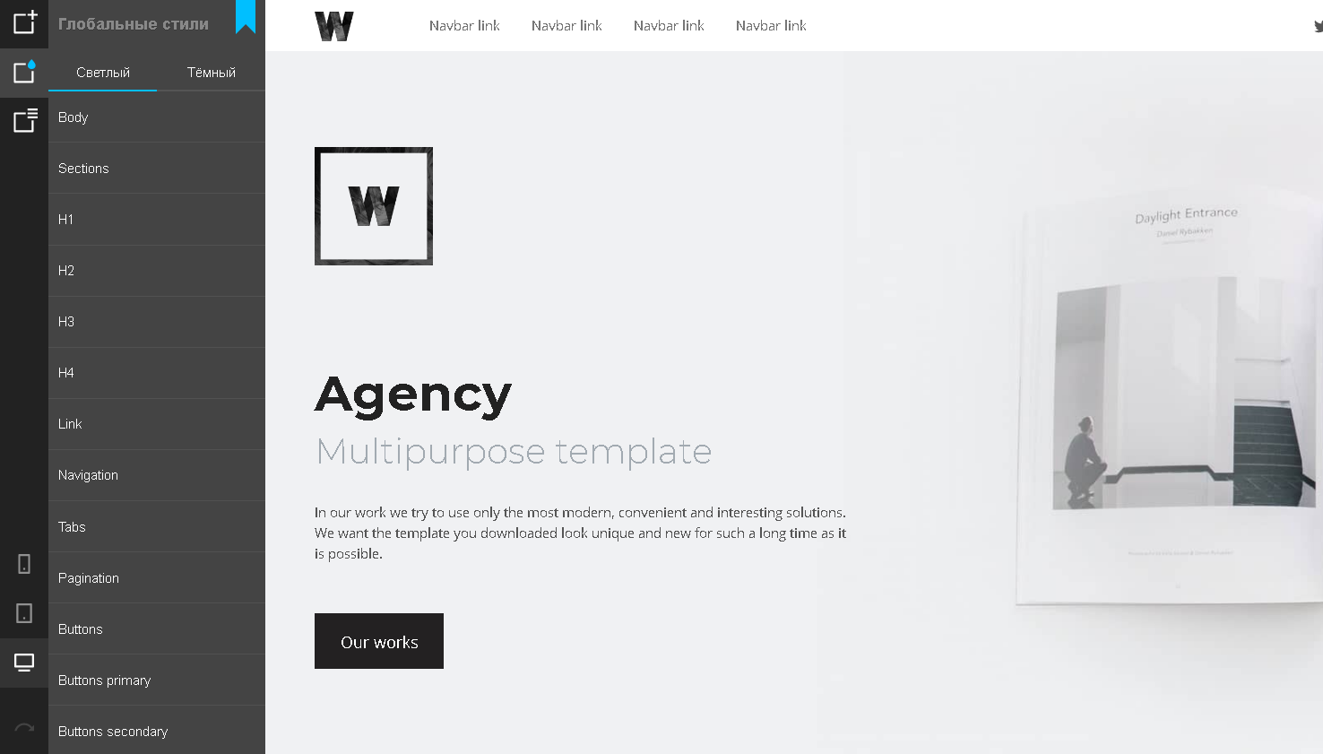
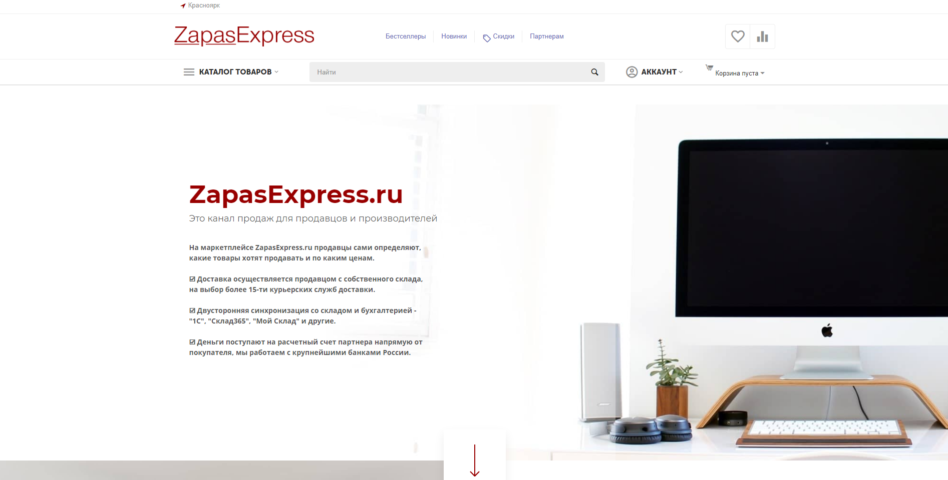
ПРИМЕР ГОТОВОГО САЙТА, СДЕЛАННОГО В КОНСТРУКТОРЕ W3

Актуальность инструкции - v. 1.1.8